Strawberryluna

Book Cover Design in India 1964 to 1984, from 50 Watts

Click to see more from this collection.

In my morning-coffee-stumble-through-the-internet-while-waking-up ritual today I came across a fantastically cool / I can’t believe that I didn’t know about this before blog, called 50 Watts, run by Philadelphian (yay! My hometown!) Will Schofield.

50 Watts is great little space of the web covering the intersection of book collection, design, and illustration. Sounds like heaven to me.  What caught my eye was an image from a post on now vintage book covers from the 40 year span from 1964 – 1984. Here, I’ve posted a few of my favorites, but definitely check out the full post at 50 Watts here.

And yeah, part of me wishes that I could read the text on these beauties. At the same time, they still speak quite clearly and the other part of me loves being able to make up stories about what these stories are about.

Click to see more from this collection.

Mostly, I just adore the flatness of the color fields, the kapow! of their graphics and layout, and symbolic style of the illustrations. Being a silkscreen printmaker, there is something so excellently familiar about the way that these were printed, probably cheaply, probably in a spot, or one color at a time process like screenprinting. You can see the areas where pieces aren’t in perfect register, or where colors overprint one another, and the use of halftones to mimic saturation levels of a color. All make my heart do little flips. The limitations of this type of printing force incredibly creative and freeing design and illustration choices, which, clearly I love and have embraced as a career. So, no. It’s no surprise that I dig these. I hope that you do too.

Click to see more from this collection.

Click to see more from this collection.

Oh happy day, ohdeedoh’s piece on our prints!

Click here to read the full post on ohdeedoh!

I woke up to a happy surprise today, the fantastic blog ohdeedoh wrote a really lovely piece on our prints! ohdeedoh is the perfect intersection of home & kid-friendly design, which is a really cool niche, as it insists on being very livable rather than high-concept focus. I love that. We’re just tickled that author  Sarah Rae Trover at ohdeedoh found our work and wrote such a fresh post about us. With the hand silkscreen printing process being so labor intensive (a “simple” 3-color print, edition of 100 takes 6-10 hours to complete), I can’t tell you how refreshing and awesome it is to see that a great blog like ohdeedoh gets it. Thank you so much!

Here is a little snippet for you:

“When it comes to artwork for children’s rooms it can be rare to find actual screen printed pieces that most parents would consider affordable. These 10 items all come in under $25 and are all handmade, layer by layer and color by color.”

With the full post right here, or click on the above image.

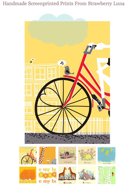
All of the featured prints above (and more, of course!) are available at my website here, or click any of the below images to see larger images and more information on my hand silkcreen printed art prints & posters.

Nursery Art Prints collection by EvenAndy


Stationary designer and blogger EvenAndy is a busy lady! A working, stay at home mom to 2 little ones, she took the time to put together this sweet blog post collection of some of her favorite nursery art prints found on Etsy.

Thanks so much for including our T is for Turtle Alphabet Print!

Visit her blog here, Nursery Art Prints and check out EvenAndy’s Etsy shop here.