Strawberryluna

Happy Thanksgiving To All!

Happy Thanksgiving everyone! It’s been a crazy year for us, and we are so thankful for so many of our amazing friends and families.

This year we are hosting a big Friendsgiving dinning, and as always, Charles Schulz portrays this best.

We hope that you have a lovely time with family and friends eating just a wee bit too much and enjoying the warmth. And click the image above (or right here) to watch the Charles Schulz’s classic “A Charlie Brown Thanksgiving” ❤

From us to you, all the best & brightest!


Kay Nielsen: Illustrations of Gorgeous Form & Light in “East Of The Sun & West Of The Moon”

Kay Nielsen illustration from “East of the Sun, West of the Moon”1914, via Brain Pickings.

‘And then she lay on a little green patch in the midst of the gloomy thick wood.’

As a lifelong lover of fairy tales & folk tales (quite literally, I have never grown out of my adoration for their magic and storylines ever). Like many others, I have been fascinated by the illustrations that have come to accompany theses tales in the past couple of centuries. How lucky we are in this way to have not only the tales, but books beautifully illustrated by visionary artists illuminating twists, turns, and the drama of these ancient stories.

One of my many favorites is the Danish genius of form & light, Kay Nielsen (1886 – 1957) who worked both in his native Denmark as well as the UK and the US in his career. He illustrated many books and set decorations, as well as his noted work for Disney, but today I am highlighting his unbelievably epic and lovely work in one book, “East Of The Sun, West Of The Moon”, (this version published in 1914)as it is staggering in its detail, drama and use of light and texture.

Following are some of my favorite examples from 3 pretty great sources: Brain Pickings, 50 Watts, and the Flickr feed of the National Library NZ on The Commons all of which are amazing resources and well worth your time and support.

Kay Nielsen illustration from “East of the Sun, West of the Moon”1914, via 50 Watts.

‘He too saw the image in the water; but he looked up at once, and became aware of the lovely Lassie who sat there up in the tree’.


Screen shot 2014-04-08 at 11.31.07 AM

Illustration by Kay Nielsen in “East of the Sun and West of the Moon”, 1914, via National Library NZ on The Commons

‘On that island stands a church; in that church is a well; in that well swims a duck.’


Illustration by Kay Nielsen for “East of the Sun and West of the Moon”, 1914 via Brain Pickings

‘The King went into the Castle, and at first his Queen didn’t know him, he was so wan and thin, through wandering so far and being so woeful.’


Kay Nielsen illustration from “East of the Sun, West of the Moon”1914, via 50 Watts.

‘So the man gave him a pair of snow-shoes.’

Illustration by Kay Nielsen in “East of the Sun and West of the Moon”, 1914, via National Library NZ on The Commons

Illustration by Kay Nielsen in “East of the Sun and West of the Moon”, 1914, via National Library NZ on The Commons

‘He took a long, long farewell of the Princess, and when he got out of the Giant’s door, there stood the Wolf waiting for him.’

Published in 1914, this version of “East Of The Sun, West Of The Moon” marks a high point in the American era known as the Golden Age Of Illustration (roughly from the 1880’s through the early 1920’s). We will we publishing more posts from some of our favorites from that time in the near future. Thanks for reading & I hope that you enjoy!

Hooray! It’s Handmade Arcade Time on December 7th!

HA13_728x90Yinz guys! It’s finally time for Handmade Arcade!

On Saturday (and Saturday ONLY) December 7th, Pittsburgh’s biggest and most spectacular array of handmade makers, talent, artists and crafters arrive from all over the country for the amazing Handmade Arcade.

It’s one of our favorite shows of the entire year, and we’re so thrilled for Handmade Arcade’s special ten-year anniversary and can’t be more honored to be vending at this truly one-of-a-kind show. And trust us, we do shows all over the country! HA pulls in shoppers from the tri-state area to find lovely and well crafted handmade pieces for everyone their holiday shopping lists. Handmade Arcade is not to be missed.

We will have lots of new pieces and hand printed, and hand drawn art prints, rock posters, and more on hand, as well as a special collection of framed prints, ready to be gifted right away!

Handmade Arcade is FREE to attend and is very family-friendly. For a full list of 2013 Vendors click here.

(Above photo by Joey Kennedy.)

Details:

  • What: Handmade Arcade, the region’s largest independent and handmade craft fair. now in it’s 10th year. A highly anticipated annual event, HA attracts more than 8,000 attendees in one day. HA provides craft artists working outside mainstream and fine arts sectors with a grassroots, high-visibility venue to sell wares, build community, network, and share their artistic practice.
  • Where:  The David L. Lawrence Convention Center, in Downtown Pittsburgh, PA. For directions and parking information click here.
  • When: Saturday, December 7, 2013 from 11am to 7pm. ONE DAY ONLY!
  • Why: Because Handmade, right here in the USA is best!

HA13_600x320

Handmade Arcade features tons of super cool maker demos and fun hands-on projects to create all sorts of make-and-take items in the Hands-On-Handmade section including screenprinting demos by Artists Image Resource (AIR), (where we learned to hand pull our screenprints!) DIY collar making by ModCloth, LED accessory making by Assemble, and so much more. Click here for the full list!

(Above photo by Joey Kennedy.)
Early Birdie Passes are available for $15 each, which provide shoppers with the exclusive opportunity to shop one hour before the event opens to the public. Early Birdie shoppers will have first pick to purchase all the unique and one-of-a-kind items that crafters will be selling and be given a bag full of goodies and coupons. (Children 12 and under are admitted free with an adult.) Passes can be purchased online or at Wildcard at 4209 Butler Street Pittsburgh, PA 15201.

(Above photo by Joey Kennedy.)

This year’s Handmade Arcade will also feature welcoming live musical entertainment by Colonel Eagleburger’s Highstepping Goodtime Band and pop-up performances by Continuum Dance Theater.

Throughout the day, Handmade Arcade will feature DJ sets by Pandemic, Bad Seed, Max Terasauro of Pittsburgh Record Fest and The Garment District. Lunch items, snacks and refreshments will be available for sale on site.

For more Shopper Info including directions and parking information click here! Hope to see you there!

Happy Halloween Vintage Postcard Round-up!

Screen shot 2013-10-30 at 1.15.29 PM

Happy Halloween! We hope that you get lots of treats today and no tricks. Well, maybe a few…

Halloween is my favorite holiday, not just for the candy, but for the long and twisted road of tradition wending it’s way into the distant past, through history, pagan cultural artifacts and religious rites, harvest festivals and communal celebration as what we know now as Halloween is based on festivals such as Samhain traditionally marked the beginning of the increasing darkness that becomes a long winter.

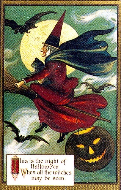
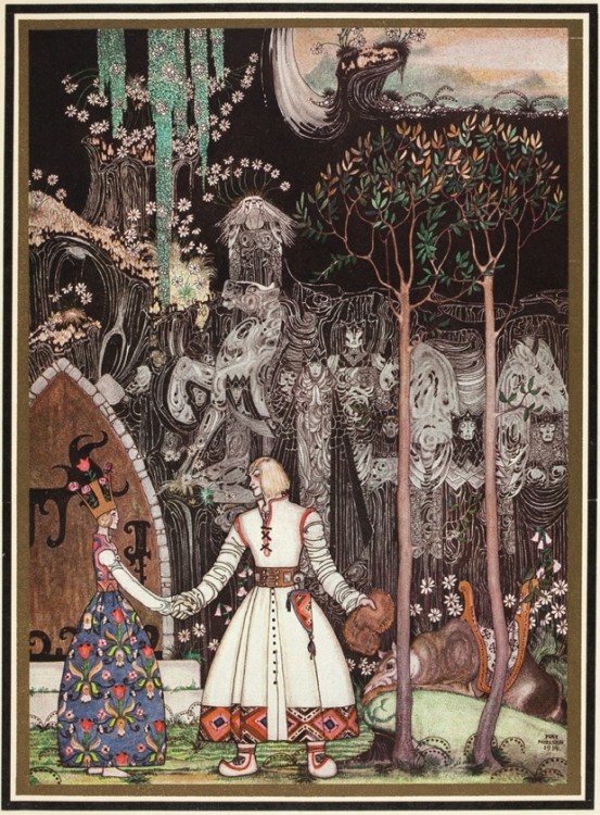
So let’s get started with some vintage postcard finds! Anyone can imagine an iconic witch, as above, riding on her broomstick with her Familiars. And not that it’s not a beauty, but I tend to really love the more offbeat vintage postcards. Especially the ones where the narrative and the symbolism seems pretty obscure and stranger than normal. (All postcards in this roundup are clickable and will take you right to the sites where I found them too.)

For example, this fine bat adorning a pumpkin with a candle running horizontally and lit at both ends. The poem on the postcard shares a little folk magic.

Screen shot 2013-10-30 at 1.07.45 PM

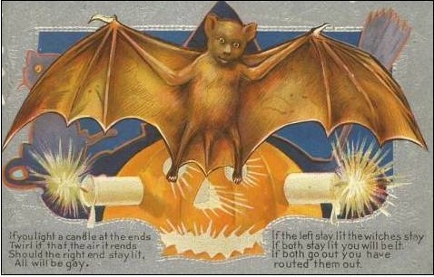
If you light a candle at the ends / Twirl it that the air it rend / Should the right end stay lit / All will be gay./ If the left stay lit, the witches stay / If both stay lit, you will be it. / If both go out, you have routed them out.

Good to know! If such home magic was once more readily known, I’d bet this below scene with a pretty young witch would also be of use, with many a candle a-lit.

vintage halloween card retro (2)

And while on the topic of witches, I loved these two below that sort of speak to a White Magic type of crafting more than Black Magic:

Halloween | Senos atvirutės

These two symmetrical, twin witches are wearing unusually light colors, and even their twin black cat familiars sport white collars. Look, all they are trying to do here is hook you up with the love of your life. So what if a little incantation is needed?

Halloween | Senos atvirutės

The same goes for the above lovely matchmaker. Her face radiates like the woman on Contadina tins, just happily cooking away with her white owls and black bat motifs. Perhaps the young miss below is one of their clients, hoping to find true love among the many pumpkin bachelors in her class.

Halloween | Senos atvirutės

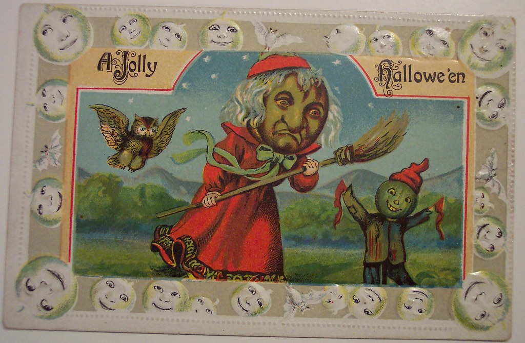
But let’s move on to less beautiful witches, as they are much more fun. The below has something of a goblin mixed with a Cardinal going on, which is just fantastic.

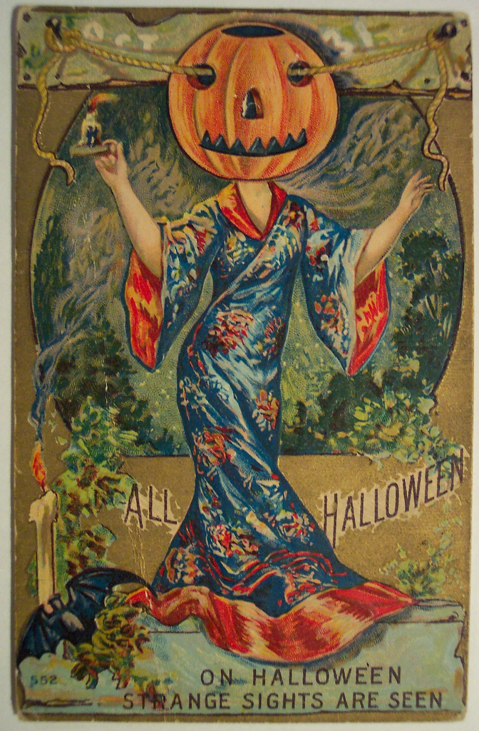
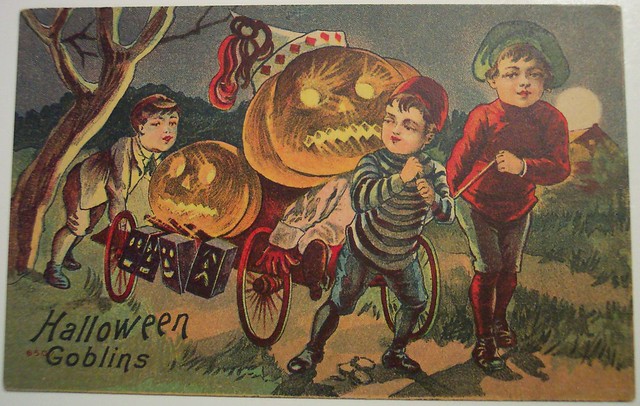
Now clearly we have meandered over to Pumpkinheadville. In the below postcard, I am sure that Asian robed lady once was beautiful, but in this scene? She scares the hell out of me. And that is what All Hallows Eve is all about!

vintage halloween paper scrap (12)

A little flight into the surreal, with a false reflection of a giant owl? Or is the creepily white sheeted man a terrifying reflection of the owl? We may never know.

‘O! Charming little punks:

Now I present, two examples of a sub genre I love, where the Devil is being totally awesome at parties. Here he helps himself to carefully laid bounty of goodies with his (fruit? Veggie?) buddies:

Halloween | Senos atvirutės

And best, here he is planning the menu! With living anthropomorphized fruits, wine and a lamp looking on, and completely stoked.

Halloween | Senos atvirutės

Supernatural Mischief Chefs!

Vintage Halloween Postcards and Halloween superstitions from the turn of the century!  llittlemisscelebration.com

I’m also a big fan of the more spooky / supernatural themed postcards as well. Lots of Victorian “mirror gazing” and other small spells play out in scenes where the participants are hoping to peer into the future and see their One True Love to come. This one is especially beautiful with the young, fairly innocent looking girl’s shadow casting against the wall as a dark witch and her one-day partner in crime appearing only in the mirror. Truly classic horror movie stuff.

Halloween | Senos atvirutės

Nope, not scary or spooky at all.

Vintage Halloween Postcards and Halloween superstitions from the turn of the century!  llittlemisscelebration.com

This one is just gorgeous. How many times have I stayed up too late reading a scary book only to be regret it at the slightest sights sounds? Many, many.

Vintage Halloween Postcards and Halloween superstitions from the turn of the century!  llittlemisscelebration.com

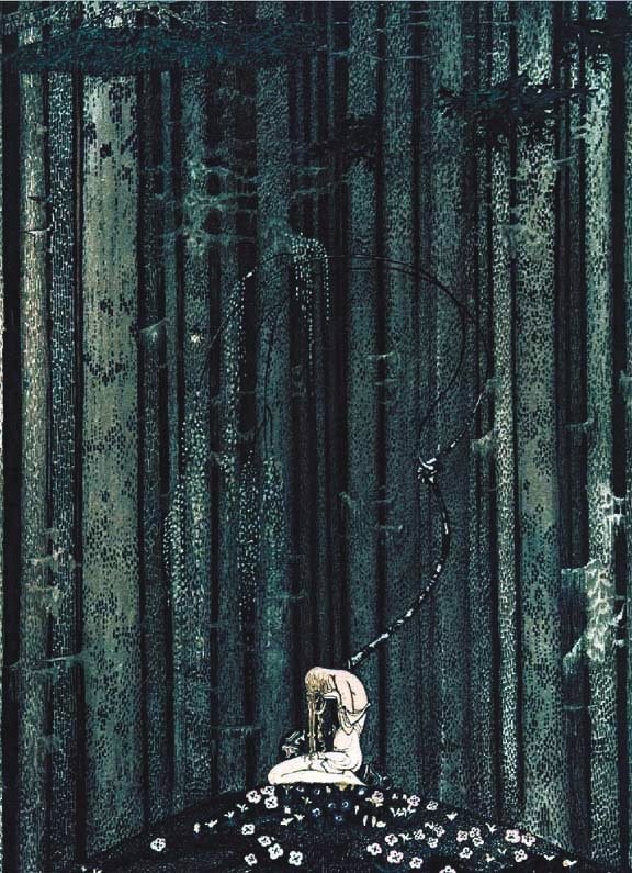
Honestly? I just have no clue what is happening here. And that is awesome.

Halloween | Senos atvirutės

And while this isn’t a postcard? It’s the damn creepiest vintage kid in a Halloween costume photograph that I’ve seen. Eeeeee! Happy Halloween everyone!


Abandoned London Tube Poster Treasures

notting hill gate disused lift passageway Vintage Posters Discovered in Abandoned London Tube Station

(All images by Mikey Ashworth.  Copyrighted by London Underground and reproduced with permission.)

Like all subway systems and tunnels engineered by humans, the London Undergound has plenty of now-abandoned stations and spurs and passages.

Unlike most, there is a very special, and very abandoned, very non-public now-unused part of the Notting Hill Gate station that houses some lovely examples of UK poster design from it’s Mid-Century high point.

However, photographer Mikey Ashworth was able to gain access and take these photos. And you can see more of his photos here at Flickr.

(All images by Mikey Ashworth.  Copyrighted by London Underground and reproduced with permission.)

Above, good time UK Party Travel by coach poster, as imagined by poster artist Victor Galbraith, 1958.

The elevator passageway is well abandonned, but its original posters from the day the station was closed still hung on its tiled walls advertising all sorts of bright bits of the world of travel, exhibitions, film, toothpaste and more to no one these days.

posters notting hill tube

(All images by Mikey Ashworth.  Copyrighted by London Underground and reproduced with permission.)

The above “Royal Blue Coach Services” poster illustrated by the UK poster artist powerhouse and one of my favorite all-time illustrators, Daphne Padden.

These beauties are a stunning collection of illustration, type design and ad layouts from the late 1950’s, still in their native habitat. Which makes them extra special.

abandoned posters notting hill gate Vintage Posters Discovered in Abandoned London Tube Station


(All images by Mikey Ashworth.  Copyrighted by London Underground and reproduced with permission.)

Most unfortunately, for a poster and design nerd like myself, these amazing, vibrant and powerful examples of advertising poster design are completely inaccessible to the public and are likely to stay so for the forseeable future. Once the renovations to this station were completed in 2010, this abandoned passageway was walled back up and sealed off from use again.

Still, many thanks to Mikey Ashworth and the London Underground for publishing these photographs of a poster age (sadly) gone by.

Come see us in Chicago at Renegade Craft Fair this weekend!

On the road again! We’re so thrilled to be a part of one of our favorite shows of the year, the amazing Renegade Craft Fair in Chicago, IL.

Join us and over 300 (yep! Amazing right?) of the most talented and cool makers of handmade awesome in the country & beyond. We will have lots of new prints and posters and more, so don’t miss out friend!

Renegade Craft Fair is FREE to attend.

 When: September 8+9, 2012 from 11am – 7pm each day

Where: Along Division Street from Damen to Paulina in Wicker Park for the biggest + best Renegade Craft Fair of them all!

What: We’ll have hundreds of today’s greatest indie makers along with interactive workshops, tasty local food + booze, music + more. Get ready, Chicago, it’s going to be the best RCF yet!

Why: Because handmade is best!

Check out this year’s lineup of amazingly talented artists!

Check out hands-on activities from Vogue Knitting (they’ll be leading make-and-take knitting workshops), the Chicago School of Shoemaking (you can stamp your own leather pieces and watch shoes being made by hand), Lillstreet Art Center (you can try your hand at using metal-stamping techniques to make your own pendant), the Student Art Therapy Association of SAIC (they’ll be leading worry doll-making workshops, a community weaving project, and a t-shirt necklace project), Girls Rock! Chicago (make a rad rock-and-roll button), the Urban Prairie Waldorf School (students from the school will be teaching you how to make jump ropes from organic fabrics), andPébéo (you can paint your own ceramic tile with their new paint pens). The Vintage Bazaar will host a pop-up vintage market at Renegade. Make sure to visit their section of the fair at Division and Wolcott.

Below is a handy map for you, with the strawberryluna Booth #6 Location. Want to see a larger version? Click here or on the image below. You’re welcome.

Hope to see you there!

“Elephants In The Trees” – Our Test Print Gallery Show At Rotofugi!

Hello friends!

We have some exciting news on the fine art front that we’ve been dying to share for over a year. And now the time has come!

The fantastic Rotofugi Gallery in Chicago, IL is home to our new Gallery show of 16 hand silkscreened Test Prints / Monoprints as well as a brand new black & white silkscreen, monochromatic, oversized, 2-art-print-set. Our show, “Elephants In The Trees”, opens on Friday January 13,  2012. But don’t be scared, Friday the 13th is always a lucky day for Allison, she was born on one.

What’s a Test Print, aka a Monoprint? Glad you asked! It’s a form of absolutely one-of-a-kind printmaking. A great definition from Wikipedia:

“Monoprints are known as the most painterly method among the printmaking techniques; it is essentially a printed painting. The characteristic of this method is that no two prints are alike. The beauty of this medium is also in its spontaneity and its combination of printmaking, painting and drawing media.  Monoprints may also involve elements that change, where the artist reworks the image in between impressions or after printing so that no two prints are absolutely identical.”

We’re absolutely thrilled, nervous, and excited all at once. Allison is almost always working on a tall stack of silkscreen Test Prints in the studio with each new print run. However, they rarely see the light of day publicly. Especially over the past year while she has been working on a suite of individual prints for this Gallery show in particular. And this is a first, with the debut not only of most of these absolutely one-of-a-kind monoprints but also of a new oversized 2-print set, (expertly printed by our friends at Delicious Design League). All prints on display will be for sale exclusively through the Rotofugi Gallery, both in person and online.

And here’s the thing, we can’t show you much before the Opening on Friday January 13th, 2012 BUT! You can totally sign up for the Rotofugi Gallery’s preview email list RIGHT HERE and get a beautiful eyeful of this (and any upcoming shows) special private preview and see the artwork for yourself before the general public. Trust us, this makes trying to buy original art and one-of-a-kind pieces far easier. ‘Cause once they are sold ‘cuz, they’re gone forevers.

Until then, here’s a little sneak-peek teaser of just a few of our 16 silkscreen printed, individual, one-of-a-kind Test Prints in the our upcoming show.

We hope to see you there on Friday, January the 13th at the opening reception!

Sneak-peek at just a few of our Monoprints to be shown at Rotofugi.

The Gallery Show Details

Elephants in the Trees: Silk Screen Monoprints & Art Prints by strawberryluna

  • Opening Reception at Rotofugi: Friday, January 13, 2011, 7-10PM
  • Rotofugi Exhibition Dates: January 13 – February 5, 2012
  • Rotofugi Location: 2780 Lincoln Avenue, Chicago, IL 60614
  • Rotofugi Phone: 773-868-3308
  • Google Map

Hit Them With The Razzle Dazzle – WWI British Navy Ship Cammo

normal-wilkinson-inventor-of-dazzle-camouflage

The Father of Dazzle Camouflage, Norman Wilkinson

When you are interested in design, technology, perception AND history? (As I am.)  Sometimes a story comes along that feeds all 4 things.

This post, borrowed from Twisted Sifter does just this. And rather than blab on about why this is so damn cool, I’ll just let you check out an abridged version here and hopefully, marvel like we have at this ingeniuous and extremely cool graphic solve to a fatal problem of war.

For the full blog post with many more photographic examples, please visit Twisted Sifter or click on any image.

__________________________________________________________

You are the Fleet Admiral of the Navy in WWI what do you do?

THE SITUATION

You’re the Fleet Admiral of the Navy in World War I. Your ships are being sunk at an alarming rate by the devastatingly effective German U-Boat. The traditional camouflage isn’t working because your environment (sea and sky) changes with the weather. What do you do?

ww-i-dazzle-painting-camouflage

THE INSIGHT

World War I occurred from 1914–1918; back then sinking an enemy battleship was a three-step process:

Step 1: Locate your target’s position and plot its course.
Step 2: Determine the ship’s speed and confirm the direction it is heading
Step 3: Launch torpedo not directly at the ship, but where you think it’s going to be by the time the torpedo reaches the ship.

*Remember this is early 20th century warfare, weapons don’t travel at the speed they do today

So what’s your solution Fleet Admiral?

HIT THEM WITH THE RAZZLE DAZZLE

world-war-1-dazzle-camouflage

Forget about not being seen, that only solves their first problem. Focus on confusing them so they don’t know where you’re going. Then their torpedoes will be shot in vain because they thought you zigged when you really zagged.

British Artist and naval officer Norman Wilkinson had this very insight and pioneered the Dazzle Camouflage movement (known as Razzle Dazzle in the United States). Norman used bright, loud colours and contrasting diagonal stripes to make it incredibly difficult to gauge a ship’s size and direction.

It was cheap, effective, and widely-adopted during the War. Check out the incredible photographs below.

dazzle-painting-a-boat

*NOTE: Unfortunately the images are in black and white, being from the early 1900s and all, so the loud, bold colours will require a little imagination. Can you picture a fleet of electric yellow, orange and purple ships coming to get ya!

dazzle-camouflage-sketches

razzle-dazzle-paintjob

dazzle-painting-ship

Happy Thanksgiving!

Wishing you all a Happy Thanksgiving in all of it’s meanings for you.
We hope that your holiday is as magical as this perfect Charles Schulz scene from A Charlie Brown Thanksgiving. Happy holidays!

Happy Halloween!

Best holiday of the year. At least I think so.

Enjoy & Happy Halloween all you witches & goblins!

We’re having a Fab Sale!

Click to go to Fab.com!

We are mega-excited to announce our very first Fab.com sale, and it’s coming up soon.

For just 72 hours starting this Saturday 10/1/11 we’ll be featured on the amazing design loving and fabulous Fab.com.

With special discounts to Fab.com members of 30% – 40%  off of our day-to-day retail, there will be tons of great deals will be available on our hand silkscreen printed rock posters, art prints, complete sets of our Alphabet Prints, and a brand new line of adult super soft tees will be available for just 72 hours. But only to Fab.com members.

Fab.com is a member-only, extremely well curated design+art shopping site featuring flash sales of 72-hour duration with special deals, available exclusively at Fab.com.

Not already a member? Why not silly, it’s FREE! To get a your free Fab.com account use this invite link and see what the fuss is about. 

Don’t forget, our sale runs for just 72 hours and starts Saturday 10/1, and once the sale is over, done, and gone….BOOM! It’s gone forever.

Already a member of Fab.com? Click to see our special sale preview!

Re-post from 8 Hour Day “Girls Just Want To Have Fun”

Yep, this is a full re-post of what I think is a great, important, and should be seen by anyone interested in design type of blog post. I think that Katie Kirk, one half of the lovely couple behing the design studio 8 Hour Day said it best, so I’m just spreading her words and images below.

So awesome to see some of the best women designers and illustrators out there too, friends, peers, and new to me talents who kick ass in this field every day.

*Please note – The below is a post originally written and collected by Katie Kirk of 8 Hour Day, not myself, so if you dig, also go over there and check them out, comment there too and support them as well. Cheers all!

There’s been a lot of discussion happening around a recent Good Magazine article entitled “Why We Can’t Let Design Become a Boys’ Club” by Dylan Lathrop. It has spawned numerous comments, opinions,counter arguments and retorts from all sides. Many of us feel strongly about this, and it’s definitely a subject with many shades of gray. Though we may not all agree on the matter, I think the fact that it’s being discussed at all is great. After reading through all the articles and all the commentary, I felt compelled to showcase some of the women that continue to inspire me. So here are some of my favorites–thanks for the inspiration, ladies!


Aimee Gauthier


Allegra Lockstadt


Allison Newhouse


Anchalee Chambundabongse


Angie Lewin


Anke Weckmann


Annette Marnat


Anne Ulku


Autumn Whitehurst


Celeste Prevost


Danielle Davis


Deanna Halsall


Eleanor Grosch


Elsa Lang 
(Always With Honor)


Erin Fuller


Esther Aarts


Gemma Correll


Gina Triplett


Gracia Lam


Helen Dardik


Jacqui Oakley


Janine Rewell


Jennifer Daniel


Jenny Bowers


Jessica Hische


Jessica Walsh


Jillian Tamaki


Julia Rothman


Karen Goheen 
(Two Arms)


Kate Bingaman-Burt


Kelli Anderson


Kelly Munson


Kristina Collantes


Lauren Gregg


Laurie DeMartino


Lotta Nieminen


Lydia Nichols


Maria Janosko


Maricor/Maricar


Meg Hunt


Melissa Buchanan 
(The Little Friends of Printmaking)


Missy Austin


Natalie Schaefer


Parliament of Owls
 (Meg Paradise, Lauren Sheldon & Ariana Dilibero)


Ping Zoo


Roxanne Daner


Sanna Annukka


Sarah Labieniec


Sara Lintner


Sol Linero


Susie Ghahreman


Tonya Douraghy


Tuesday Bassen


Valerie Jar


Veronica Corzo-Duchardt 
(winterbureau)


Sharon Werner & Sarah Forss 
(Werner Design Works)


Zeloot

Book Cover Design in India 1964 to 1984, from 50 Watts

Click to see more from this collection.

In my morning-coffee-stumble-through-the-internet-while-waking-up ritual today I came across a fantastically cool / I can’t believe that I didn’t know about this before blog, called 50 Watts, run by Philadelphian (yay! My hometown!) Will Schofield.

50 Watts is great little space of the web covering the intersection of book collection, design, and illustration. Sounds like heaven to me.  What caught my eye was an image from a post on now vintage book covers from the 40 year span from 1964 – 1984. Here, I’ve posted a few of my favorites, but definitely check out the full post at 50 Watts here.

And yeah, part of me wishes that I could read the text on these beauties. At the same time, they still speak quite clearly and the other part of me loves being able to make up stories about what these stories are about.

Click to see more from this collection.

Mostly, I just adore the flatness of the color fields, the kapow! of their graphics and layout, and symbolic style of the illustrations. Being a silkscreen printmaker, there is something so excellently familiar about the way that these were printed, probably cheaply, probably in a spot, or one color at a time process like screenprinting. You can see the areas where pieces aren’t in perfect register, or where colors overprint one another, and the use of halftones to mimic saturation levels of a color. All make my heart do little flips. The limitations of this type of printing force incredibly creative and freeing design and illustration choices, which, clearly I love and have embraced as a career. So, no. It’s no surprise that I dig these. I hope that you do too.

Click to see more from this collection.

Click to see more from this collection.

Flatstock 29, SXSW Festival & Austin, TX here we come!

All of the Flatstock 29 identity designed by exclusively us at strawberryluna this year!

Around these parts? Mid-March means the opening of carnie season when we start our new year of shows. And it’s super exciting to always get to break out of the evergrey of a long long  Pittsburgh winter (ummm, it snowed this past weekend. I mean, come on!) with our first trip and show of the year to sunny, warm and awesome Austin, TX.

Don’t mess with it.

We are super honored and really proud this year to have been asked to design all of the Flatstock 29 official and exclusive identity work, from banners, badges, posters, handbills and more. We also hand silkscreen printed a limited edition of the Flatstock 29 poster that we will have for sale at our booth in Austin, and then also on our website here too. If you are down at Flatstock and see these pieces, right on! We did our job well 🙂

We’ll also have a HUGE slew of Test Prints that I’ve been working on for a top-secret project (but details will be coming soon) for early next year. In the meantime, hopefully some of your will enjoy the current crop of them. ‘Cause Cousin? We got a bunch for ya.

What is Flatstock? It’s over 75-100 currently working poster artists coming to show their talents, display and sell their work and talk with new people about what we do and why. And yep, hire us! And yes, Flatstock Austin is FREE to attend and open to the public!

The details for you:

The very first Flatstock Poster Convention of the year will once again be held in Austin, Texas during the SXSW Festival. This is our 29th Flatstock to date, and the Austin Flatstock is always FREE  to attend & definitely wide open to the public. We are in a new room this year, so check below for a convenient map to help you find over 75 poster artists from around the world displaying & selling their rock posters. Hope to see you there!

Dates:

  • Wednesday March 16th – Saturday March 19, 2011

Hours:

  • Wednesday 3/16 – 2pm – 6pm  (note this is the ONLY half day)
  • Thursday 3/17 – 11am – 6pm
  • Friday 3/18 – 11am – 6pm
  • Saturday 3/19 – 11am – 6pm

Location:

  • Austin Convention Center – Level 1, Ballrooms A, B, C at 500 E. Cesar Chavez St., Austin, TX 78701 (see map below)

You DO NOT need to have badges to be able to attend Flatstock 29. It’s FREE & open to the public! For more info on Flatstock 29 & the SXSW Festival click here.

“The FLATSTOCK poster show series is presented by the American Poster Institute (API). It is an ongoing series of exhibitions featuring the work of many of the most popular concert poster artists working today.

The API is a nonprofit corporation dedicated to serving poster artists and promoting the art form. Both the API and its FLATSTOCK series were organized in 2002 as a result of conversations between interested artists and supporters frequenting the popular website GigPosters.com. The best concert posters have always captured both the essence of the music they promoted and the spirit of the time in which they were produced. This is as true today as it was in San Francisco during the Sixties.

The FLATSTOCK shows provide the general public with an ongoing series of opportunities to see fine poster art in person and to meet the artists who’ve created it — they provide the API with a way to present the poster artists collectively while showcasing the breadth of individual styles they represent.”

Click to see a larger map.

Click to see a larger map.

THE LIST OF PARTICIPATING FLATSTOCK 29 ARTISTS (subject to change):

Adam Pobiak

Animal Rummy

Anville

BadMoon Studios

Billy Perkins

The Bird Machine Inc

Boss Construction

BRIANEWING.com

The Bungaloo

Burlesque of North America

Carlos Hernandez

Clintprints

Cricket Press

Crosshair

Dan Grzeca/Ground-Up

Dan Stiles

Daniel Danger

Decoder Ring Design Concern

Delicious Design League

DKNG

Douze Studio Dresden

Empire Press

f2design

Furturtle Show Prints

Ghost-Town Studios

GIGART

Gigposters.com

guyburwell

Hero Design Studio

Hosco Press

Idiot or Genius?

Industry Print Services

Insurgent Arts

James Flames

Jason Munn

John Howard / Monkeyink

Kevin Tong Illustration

Kollective Fusion

La-La Land Posters

Landland

Lil Tuffy

Lure Design

MadPixel

Magnificent Beard

Mercerrock

Methane Studios, Inc

Micah Smith

Mig Kokinda

Mike Budai

Mike King/Crash Design

Nakatomi

Nevada Hill

OchoLocoPress

Pedal Printing

Powerhouse Factories

Powerslide Design Co

Rural Rooster

Sandusky Bay Poster Works

Shawn Knight

The Silent Giants

South Austin Popular Culture Cen…

Squeegeeville.com

STANDARD DELUXE

strawberryluna

Subject Matter Studio

Tara McPherson – Cotton Candy Ma…

Todd Slater

Two Arms Inc

UKPA

Uncle Charlie

Under Pressure Screen Printing

Vahalla Studios

VGKids

Voodoo Catbox

Vrooooom Press

Young Monster


New music released today: Toro y Moi, “Underneath The Pine”

Click!

Yay! It’s Toro y Moi new release day!

I fell in love with “Still Sound”, one of the songs off of this new record from the South Carolina based Chazwick Bundick, aka Toro y Moi earlier this month and have been waiting with just about still breath for the release of this full length record. Today’s the day. Hooray!

Check out Carpark Records to purchase and support independent music & musicians. Or, hop over to Chaz’s Etsy shop and buy a tote bag with his drawing hand screen printed onto a bag that comes with a digital download card of  “Underneath The Pine” here.

And fall in love with “Still Sound” above.