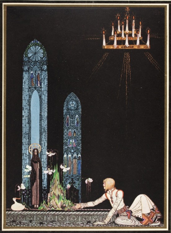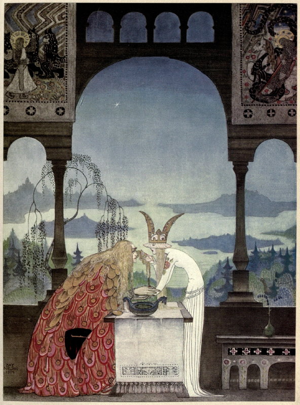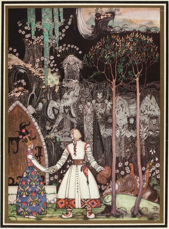
Kay Nielsen illustration from “East of the Sun, West of the Moon”1914, via Brain Pickings.
‘And then she lay on a little green patch in the midst of the gloomy thick wood.’
As a lifelong lover of fairy tales & folk tales (quite literally, I have never grown out of my adoration for their magic and storylines ever). Like many others, I have been fascinated by the illustrations that have come to accompany theses tales in the past couple of centuries. How lucky we are in this way to have not only the tales, but books beautifully illustrated by visionary artists illuminating twists, turns, and the drama of these ancient stories.
One of my many favorites is the Danish genius of form & light, Kay Nielsen (1886 – 1957) who worked both in his native Denmark as well as the UK and the US in his career. He illustrated many books and set decorations, as well as his noted work for Disney, but today I am highlighting his unbelievably epic and lovely work in one book, “East Of The Sun, West Of The Moon”, (this version published in 1914)as it is staggering in its detail, drama and use of light and texture.
Following are some of my favorite examples from 3 pretty great sources: Brain Pickings, 50 Watts, and the Flickr feed of the National Library NZ on The Commons all of which are amazing resources and well worth your time and support.

Kay Nielsen illustration from “East of the Sun, West of the Moon”1914, via 50 Watts.
‘He too saw the image in the water; but he looked up at once, and became aware of the lovely Lassie who sat there up in the tree’.

Illustration by Kay Nielsen in “East of the Sun and West of the Moon”, 1914, via National Library NZ on The Commons
‘On that island stands a church; in that church is a well; in that well swims a duck.’

Illustration by Kay Nielsen for “East of the Sun and West of the Moon”, 1914 via Brain Pickings.
‘The King went into the Castle, and at first his Queen didn’t know him, he was so wan and thin, through wandering so far and being so woeful.’

Kay Nielsen illustration from “East of the Sun, West of the Moon”1914, via 50 Watts.
‘So the man gave him a pair of snow-shoes.’

Illustration by Kay Nielsen in “East of the Sun and West of the Moon”, 1914, via National Library NZ on The Commons
‘He took a long, long farewell of the Princess, and when he got out of the Giant’s door, there stood the Wolf waiting for him.’
Published in 1914, this version of “East Of The Sun, West Of The Moon” marks a high point in the American era known as the Golden Age Of Illustration (roughly from the 1880’s through the early 1920’s). We will we publishing more posts from some of our favorites from that time in the near future. Thanks for reading & I hope that you enjoy!
.jpg)
.jpg)
.jpg)
.jpg)
