Strawberryluna

New poster released: We Were Promised Jetpacks (!)

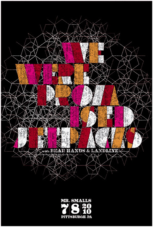
4 color, (3 screens) hand silkscreen printed poster for We Were Promised Jetpacks. (click for more info & to purchase.)

And here we go! The 3rd & final release for today, phew!

And ROMG! Do you love this band like we do? ‘Cause we sure do. If it’s not Scottish, it’s crap. And that’s pretty true as pertains to music.

This is my hand silkscreen printed poster for the super We We Promised Jetpacks‘ show with Bear Hands & Landline on July 8, 2010 at Mr Smalls, Pittsburgh, PA. The poster was sold at the show, and I have just a small number for sale, so they will go quick!

4 color (3 screens) all hand screenprinted poster with dark yellow, magenta & space black non toxic screenprinting inks and in produced in a limited edition, this poster is signed (by me, strawberryluna) and numbered. Overprint magical secret = Where you see red, the yellow inks were overprinted by transparent magenta to make a hot red. Yep! Edition: 105. Size: 16 x22 inches (39.4 cm x 55.9 cm.) Paper: archival Cougar, White 100lb cover weight. I design & hand screenprint my prints and posters. If you have any questions, just let me know.

This poster was super fun to print, and it’s so awesome that We We Promised Jetpacks totally brang it for the show too. See them live DARN IT.

We Were Promised Jetpacks poster is now available from my website here.

Process photos below for you from my Flickr account, with plenty more photos there too. Click away!
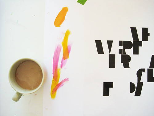
Coffee and starting to do color tests and registering for We Were Promised Jetpacks. Click for more process photos and info.
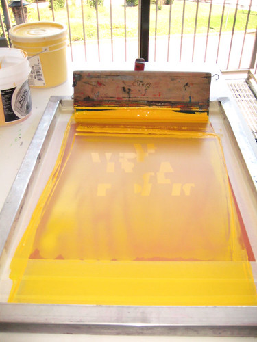
1st color ink flooded in the screen, ready to print. Click for more process photos & info.

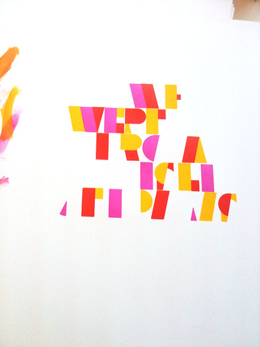
2nd color, with overprints making red showing, of my 4 color hand screenprinted poster for We Were Promised Jetpacks. (click for more process photos or info.)
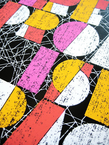
Close up of the textures! 4 color, hand screenprinted poster for We Were Promised Jetpacks. Click for more process photos & info.
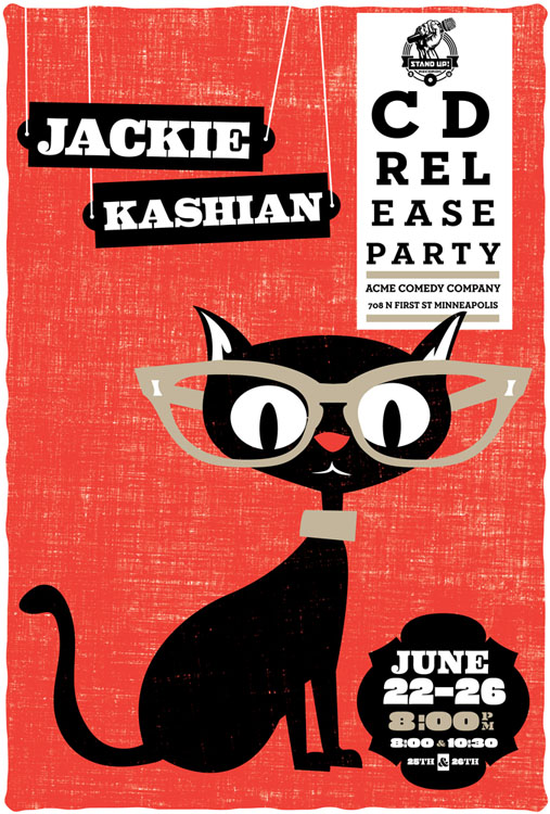
New poster released: Jackie Kashian CD release party poster

3 color, hand screenprinted poster for Jackie Kashian. (click for more info & to purchase.)

The first in a slew of new releases. Ok. Well, if 3 new releases can be a slew, then call me Seattle.

Jackie Kashian is a danged funny person. No, really, check out her newest CD release It Is Never Going To Be Bread or a live show to prove me wrong. Go ahead, I’ll wait. ‘Cause you won’t be able to prove me wrong. And this poster is for her new CD release party set of shows in Minneapolis, MN on June 22- 26th, 2010 at Acme Comedy Company.

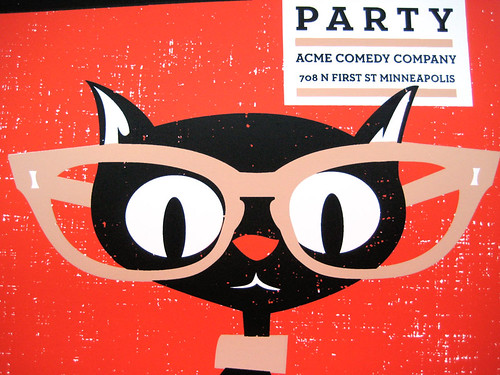
This kitty-kitty at an ophthalmology appointment my all hand screenprinted poster for super rad Jackie Kashian’s CD Release party shows at Acme Comedy Company in Minneapolis. It’s my 3-color, scene of a poster with bright red, sensible beige and black cat black, hand mixed and non-toxic water based screenprinting inks.

Like all of my posters, this limited edition silkscreen poster is signed (by me) and numbered in a limited edition of 80. Size: 16 x22 inches (39.4 cm x 55.9 cm.) Paper: archival Cougar, White 100lb cover weight. This poster was available from Jackie Kashian, at her CD Release party shows and then it will also be available for $20 + shipping & handling from Dan Schlissel at  Stand Up Records, her CD/record label’s website thereafter, contact Stand Up Records:

Website: http://www.standuprecords.com
Email: Dan Schlissel – ismista [ a t ] yahoo dot com

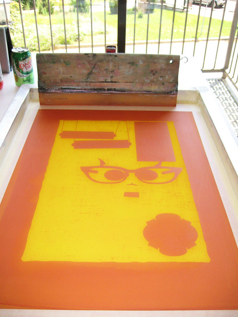
And! Would I forget some process photos? Come on. Below and always more over in my Flickr account.

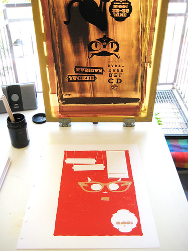
1st color screen, ready to print. Click to see more process photos.

3rd color about to be printed. Click to see more process photos.

Detail of kitty-face. Click for more process photos.

Brand new Flatstock blog debuts with a bang! HUGE poster Giveaway Contest

If you read this blog regularly, or visit GigPosters.com, or are into the modern rock poster movement, you’ve (at the very least) heard of  “Flatstocks“. But what all are they and how can you learn more, or keep up on which Flatstocks are where & when?

Via the new Flatstock Blog! HUZZAH!!

The new Flatstock Blog is a clearinghouse of sorts for up-to-date information on upcoming Flatstock Poster Shows, with lists of attending artists, time & date & location details, and that’s just the start. The Flatstock Blog is debuting with the following super posts:

Click here to enter the HUGE Poster Pack Giveaway at Flatstock 26!!

Coming soon to the Flatstock Blog there will be profiles, interviews, special sneak peaks at new Flatstock Artists’ projects and tons more in the coming months, so keep an eye on the new Flatstock Blog. Visit by clicking the banner above or right here!

Related Flatstock links:

Flatstock on Facebook

Flatstock on Twitter

Flatstock on Myspace

Flastock Blog

American Poster Institute

About Flatstock Poster Shows:

The FLATSTOCK poster show series is presented by the American Poster Institute (API). It is an ongoing series of exhibitions featuring the work of many of the most popular concert poster artists working today.

The API is a nonprofit corporation dedicated to serving poster artists and promoting the art form. Both the API and its FLATSTOCK series were organized in 2002 as a result of conversations between interested artists and supporters frequenting the popular web site GigPosters.com. The best concert posters have always captured both the essence of the music they promoted and the spirit of the time in which they were produced. This is as true today as it was in San Francisco during the Sixties.

The FLATSTOCK shows provide the general public with an ongoing series of opportunities to see fine poster art in person and to meet the artists who’ve created it — they provide the API with a way to present the poster artists collectively while showcasing the breadth of individual styles they represent.

New poster released: The New Pornographers in NYC!

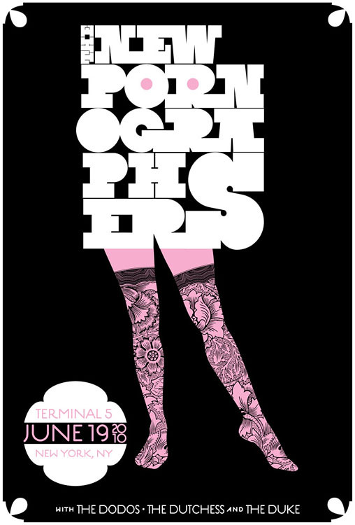
Hot-cha! 2-color, all hand screenprinted poster for The New Pornographers' show at Terminal 5 in NYC. (click to purchase or for more info)

I’m a little late to post this, my apologies. Summer brain seems to have taken a good hold of me lately when I’m not working.

Anyhoo, here is our latest poster, and we’re pretty danged excited about this one. We’re a part of The New Pornographers tour poster series for their Summer 2010 tour. A tour series is where a band commissions a different poster for each stop on their tour, and it’s always a treat to see the variety of work, as well as it being a super way for fans to connect to that night’s show.

Details:

Hand screenprinted poster for The New Pornographers with The Dodos, and The Dutchess & The Duke’s show on June 19, 2010 at Terminal 5, New York, NY.

One of our long time favorites, The New Pornographers. Huzzaah! We are really excited to be a part of their summer 2010 tour poster series, where the band has a different gig poster artist do a different poster design for each stop on the tour. Plus the neato line up of bands on this tour, and, being that we’re super down with NYC, winner winner! So hey chum, you are looking at my all hand screenprinted poster for this awesome line up of bands. It’s my 2-color, suggestive and rockin’ all hand screenprinted poster with tender pink and midnight black, hand mixed and non-toxic water based screenprinting inks.
Like all of my posters, this limited edition silkscreen poster is signed (by me) and numbered in a limited edition of 240. Size: 16 x22 inches (39.4 cm x 55.9 cm.) Paper: archival Cougar, White 100lb cover weight.
This poster was sold by the band at the show on June 19th at Terminal 5, and it’s now available on my website here too for $20+ shipping. Got questions? Email me! allison [ a t  ] strawberryluna dot com.
Here are a few process photos that I took while printing too, and there are more in my Flickr account here as well. Or, just click on any image below.

A dozen types of pink to find The One.

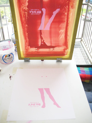
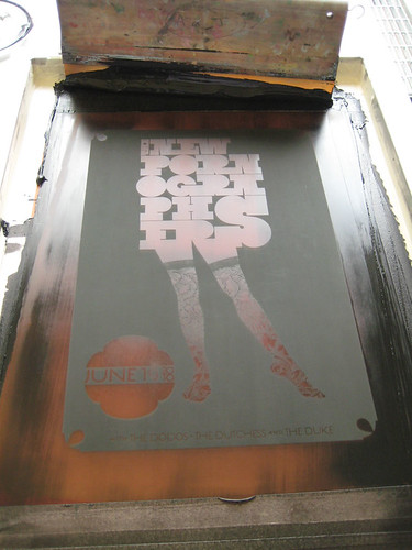
1st color printed, looking all abstract.

2nd color (black) screen after a print pull.

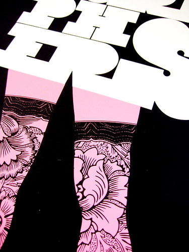
Close up & detail photo of the lace of her stockings. (click for more info)

New poster released – Vetiver at Sasquatch Festival 2010!

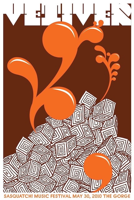
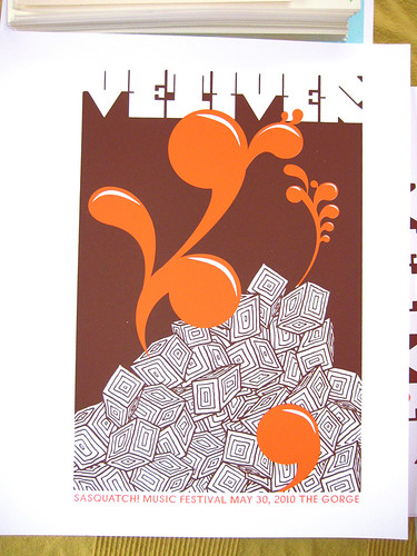
2-color, all hand screenprinted poster for the band Vetiver's show at the 2010 Sasquatch Music Festival. (click for more details or to purchase.)

Just released and ready to go! This is my new poster for the band Vetiver, from their Sasquatch Festival show this past weekend at The Gorge on George, Wa.

2010 is the 4th year in a row that I’ve had the pleasure of working with Sasquatch in their poster series that they arrange with the top poster artists from around the country, pairing them up with their favorite bands appearing at Sasquatch each year. We couldn’t be happier that we were paired up with a great band like Vetiver!

This is my 2-color, all hand screenprinted poster for Vetiver with deep brown and sunset-orange, hand mixed and non-toxic water based screenprinting inks. These posters are signed (by me) and numbered. Edition of 90. Size: 16 x22 inches (39.4 cm x 55.9 cm.) Paper: archival Cougar, White 100lb cover weight.

I design & hand screenprint my prints and posters. If you have any questions, just let me know!

My new poster for Vetiver is now available at my website here.

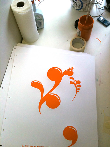
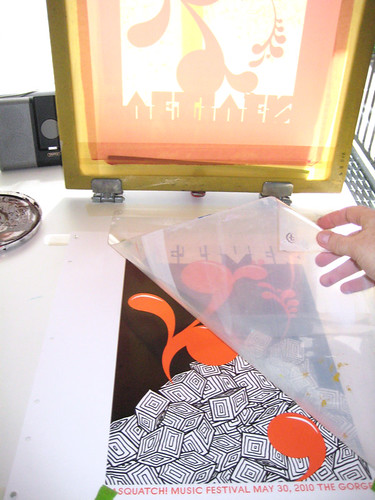
Below are some process photos of this poster being printed by me at my studio, click any image below to see more at my Flickr page too.

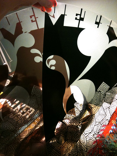
Films to burn screens for my Vetiver poster. The left / lighter one is too light, the right / darker one is perfect.
1st color of my poster for Vetiver's Sasquatch Fest show.

Getting set up and registering the 2nd color of my Vetiver poster. (click for more info.)

All done! 2 color, hand screenprinted poster for the band Vetiver. (click for more info.)


moe. Snoe.down ice sculpture, based on our poster!


Awesome ice sculpture by Ben Rand at Moe.'s Snoe.down 2010, with our poster characters.

So how often does this happen? You design a poster for a band, illustrate characters from animals, and then BOOM! Those characters & your typography come to life in the form of an awesome ice sculpture?

Not too often. But it’s cool as hell, (pardon the pun if you must.)

The above photo was sent to me from the band Moe.’s label, it’s from their Snoe.down Festival, for which we did the official Festival poster (as below). A friend of the band named Ben Rand  is a nationally recognized ice sculpture artist and he did this interactive &  amazing rendering of our poster’s animals and even the typography that we did, with little holes to poke your head into so you could become either the Moose or the Polar Bear character right from  from our poster. Whoa! ::mindblown::

We love it!

So much so that we’re running a little contest, yep. That’s right.

If you went to the 2010 Snoe.down and have a photograph of this ice sculpture with people in it’s super faceholes, send us a copy of your photo and we’ll add it here, and add your name to the Grand Prize drawing and then choose a winner at random and send you a special winner gift of a free Snoe.down poster + super secret & special prizes! Enter in one of two ways:

1. Email us  your photo at strawberryluna { a t } strawberryluna dot com OK OK.

2. Drop a link to your photo in the comments section.

Contest Runs until April 30th, at midnight EST. Good luck!

Our screenprinted Snoe.down 2010 poster (click for more info or to purchase)

New poster released: Moe. Snoe.down 2010

My new screenprinted poster for Moe.'s Snoe.down 2010, 4-colors (click for more info or to buy)

This is our newest poster release all new and ready to go home with you:

It’s the good time winter fun fest of  Moe. and their huge Snoe.down Festival jam. We’re super excited to be working with Moe. When they contacted us, the mission was to mix things up from their previous posters and produce something fun, child-like and fresh. So, we Let loose & had a snowy good time with it for them. Wheee!

Snoe.down is the all-ages annual winter music festival hosted by moe. and not only features multiple sets by Moe., but in 2010 also playing are funk/soul group Sharon Jones and the Dap-Kings, jam-grass favorites Railroad Earth, Assembly of Dust, and Hot Day at the Zoo, southern rockers the Bridge, up-and-coming jam-rockers the McLovins, and the Heavy Pets plus Leroy Justice, Lynch, and Moon Alice.

This is my 4-color, hand screenprinted poster with snowy light blue, warm orange and black hand-mixed, non-toxic water based acrylic inks. Super secret magic: transparent baby blue & orange inks = light brown, magical overprints. (Overprints are when semi-transparent layers of ink combine and overlap to make another color.) I will have a very limited number of this poster for sale, as most of the edition was sold by the band during the Snoe.down festival. Size: 18w x 24h inches. Edition of 675. Paper: acid-free & archival Cougar 100 lb White, cover weight. $25

I design and hand screenprint all of my posters and prints. Let me know if you have any questions! Unless otherwise requested, all orders are shipped within 5 business days, though usually much sooner. I like stupid little toys, hopefully you do too because there will be one or two in your tube.

My new Moe. Snoe.down Festival poster is now available for purchase, click this link for my website or on the image above.

2 new rock poster releases! St. Vincent & The Wreckids


My 6 color, hand screenprinted poster for St. Vincent's show wi/ Wildbirds & Peacedrums in Pittsburgh on 2/21/10. (Click to purchase or for more info,)

After taking the month of January off from printing to work on some big design projects, as well as recover and regroup from a fantastically hectic summer + fall + winter 2009 work schedule, we were finally able to really focus on getting my new studio up and running for real. Craig found the space in July ’09 and I signed the lease starting in September. It was love at first sight for sure. A blog post covering the set up and construction of my new solo studio (nicknamed Friendship Studio) is definitely due. And now that it’s been one week since completing my first prints and posters there from start to finish? I’m feeling really great about all of the crazy and hard work that we did. But, more on that soon.

For now, I’m really stoked to post these new releases, as they are the first posters out of my Friendship Studio!

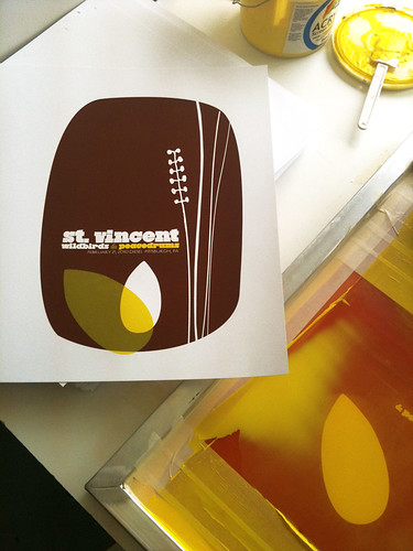
First up is actually the 2nd poster printed at my new space : that being my poster (pictured above) for St. Vincent. I’m really proud to be a part of the tour series organized for this tour, with the super cool (& Swedish!) Wildbirds & Peacedrums. The show was…amazing. Definitely try to catch St. Vincent on tour at some point this year. The above is my 6-color all hand pulled screenprinted poster with bark brown, clear yellow & magenta hand-mixed, non-toxic water based acrylic inks. Super secret magic: Three inks & 3 screens were used to make a total of 6 colors utilizing lots of overprints. (Overprints are when semi-transparent layers of ink combine and overlap to make another color.) I will have a very limited number of this poster for sale, as most of the edition was sold by the band on the night of the show & on tour. Size: 16w x 22h inches. Edition of 125. Paper: acid-free & archival Cougar 100 lb White, cover weight. Click here for more information on my website or to purchase.

And next up is actually the FIRST poster that I printed in my new studio. Is it backwards posting this first poster one second? Yes. But cousin, that’s how I roll.

My 2 color, hand screenprinted poster for The Wreckids CD release show in Pittsburgh on 2/19/10. (Click for more info!)

This poster is special all over. It’s for our dear friends The Wreckids CD release party in Pittsburgh, and you need to know a few things. 1. They are the coolest. 2. They’re awesome. 3. This poster is ONLY and EXCLUSIVELY available through the band. Yep, that’s right. So if you like it? Please help support them and purchase a poster from The Wreckids directly via their Myspace page HERE.

The Wreckids are some sweetie pies in disguise. This poster is for their CD release party for the record “Singing You To Sleep But Giving You Nightmares”, and doesn’t that just about folktale style say it all? The above is my 2-color all hand pulled screenprinted poster with blood red and midnight black hand-mixed, non-toxic water based acrylic inks. Size: 16w x 22h inches. Edition of 25. Paper: acid-free & archival Cougar 100 lb White, cover weight.

And, I finally got to take some more screenprinting process shots, only these offer some sneak peaks into my new print digs. Holy moly! Natural light! Click HERE or on the images below for more information about my hand screenprinting process & to see more photos at my Flickr page.

St. Vincent poster process photos:

2nd color printed of my St. Vincent poster. (Click for more information & photographs.)

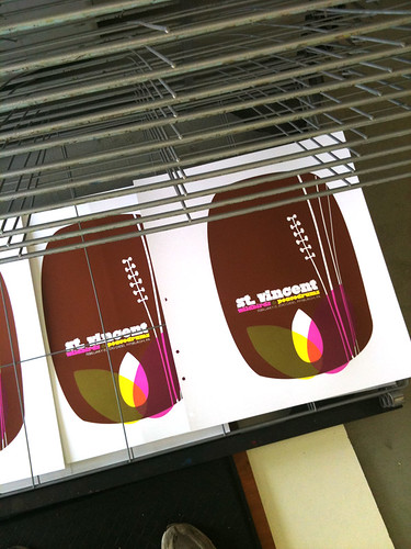
My completed hand screenprinted St. Vincent poster, drying on the rack. (Click for more information & photographs.)

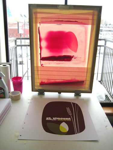
St. Vincent poster process, 3rd color flooded in the screen backlit screen. (Click for more information & photographs.)

The Wreckids poster process photos:

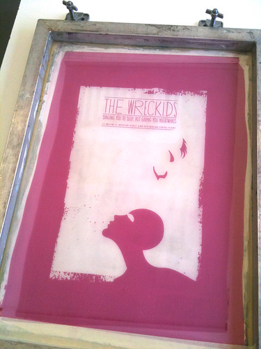
The Wreckids CD release poster 1st color screen. (Click for more information & photographs.)

The Wreckids CD release poster, racked & done SON! (Click for more information & photographs.)

My above St. Vincent poster is now available in my webstore here.

Have questions about these posters or screenprinting? Ask away! It might take me awhile, but I always write back.

La Muette, a time capsule of French advertising posters

Old advertisements revealed at La Muette. (Photo: Paul Shamble. Click for more info or to read the article 'History dans le Métro'.)

Thanks to a friend who alerted me to this link posted on the AIGA site, (thanks Dave C!) I have a cool little moment in design to share here.

Like all cities, civilization and history continually build on top of itself. One really lovely case in point is the renovations as we would say in English, also known as décarrossage in French, to denote the deconstruction of a previous style or building, of parts of La Muette Metro station in Paris, where for a short time in 2009, demolished walls revealed layers upon layers of old posters and advertisements.

Lovely decay of several posters revealed at La Muette Metro station. (Photo: Paul Shamble. Click for more info or to read the article 'History dans le Métro'.)

It seems that simply pasting up new posters was so the norm when something new came along, that this system even went so far as to work for the construction of the typical Parisian white-arched tile and rather than bother to remove these posters, they were simply walled over.

Happily!

These posters and ads, long since forgotten probably just a few short years, if not months, after being enclosed behind sparkling white tile walls in the 1950’s & 60’s, were a surprise to a new generation of contractors and architects (under the direction and employ of the RATP’, Paris’ transportation organization) apparently when the tiled walls were broken down and these gems from the past were revealed. At times, the layers of posters were incredibly thick, as you can see below.

Dense with poster and board and posters. (Photo: Paul Shamble. Click for more info or to read the article 'History dans le Métro'.)

The article, History dans le Métro’, written by Gene Tempest, a doctoral history student currently studying in Paris can be read in it’s entirety here. It’s a very cool read with neat clues about the ages of many of the posters based on cultural changes, such as the one-time use and eventual discarding of Parisian phone numbers having a place name prefix, a bit like old-fashioned American ones. While ours were more created out of neat sounding memes (PENNSYLVANIA 6500!), the Parisian name-number combinations were geographically linked to the subscriber’s location.

Plus, the article mentions Haussmann’s impact & influence on Paris, a force which can never be overstated nor over-discussed in any of its positive or negative aspects. These photos are really beautiful, and as a designer and history geek…it’s pretty dang neat to see two loves linked together in Paris, even if it was fleeting.

A torn ad for a modern design school sat hiding behind seats for decades. (Photo: Paul Shamble. Click for more info or to read the article 'History dans le Métro'.)

Damn Fine Tea & Damn Fine Design

Series 1 teas in Nepalese, Ceylon & Chinese green styles. (click for more info)

It’s hard to tickle my design and happy feathers more than something like this does. Yummy, carefully crafted teas and super dupes design all smooshed up into one awesome product. Our  design-y peers (nay, HEROES) at Aesthetic Apparatus have teamed up with the folks at Damn Fine Tea to produce a series of limited edition teas, all with an eye as careful on the design as the teas themselves. If you are a design nerd or a tea devotee, or gasp! BOTH well dang, here’s our Nirvana. This is a design dream job.

Series 2 teas in traditional English tea styles. (click for more info or to purchase)

Tea-obsessed Damn Fine Tea offer exceptional teas, sold loose and processed traditionally, rather than industrially with custom blends and styles. All with a keen eye on the quality not only of each tinning, cup and brew, but in the design factor as well. Potentially an endangered cultural species these days. Plus, each style has specific brewing tips tailored for that particular tea for the perfect cup.

We love these tins’ killer flair and style, and of course we do. They are all designed by the powerhouse of fun, rad, and on-point Aesthetic Apparatus out of Minneapolis, MN.

With each series Damn Fine Tea & AA take a fresh approach to the tea’s style and name. This is so apparent with teas such Series 1 and Series 2 pictured above (inspired by British Victorian boxers & the wonders of the Far East) and the below Series 3 & Series 4, respectively inspired by Rock’n’Roll (YES! See? It’s a triple match made in heaven!) and 2010 The Year Of The Tiger.

Series 3 teas in Rock inspired styles. (click for more info or to purchase)

Sometimes tongue-in-cheek comes off poorly, more like tongue-in-cheekiness or it just falls flat. Not so at all with these designs paired so well with these teas. For instance, the Series 2 teas come with limited edition mini-posters, replicating the awesome old boxing posters of yore. A fact that’s coolness is only amplified by the fact that Aesthetic Apparatus are rooted firmly in the rock & gig poster scene as well as the Series 2 mini-poster designs evoke the phenomenal test print style that so many know and love AA for in the first place. It’s like a hall of damn designers, errr, I mean mirrors. With designers in them. Maybe.

Moving on, just peep the below Carävan tea with it’s adorable little blood dripping pentagram, surrounded by a ring of tea like a Dark Wizard waiting for his Master. Hehe.

Series 3 teas come with a freakin’ Tour Patch too. Seriously, if the AA guys weren’t so nice and cool, you want to hate them for being so damn fun.

Hellfire!!!! (click for more info or to purchase)

And finally, the newest addition to the Damn Fine Tea line is the ultra-limited edition tea for Series 4, Yunnan tea, inspired by 2010, the Chinese Year Of The Tiger. Raaarrrrrrrrgh! Amazingly, this tea is limited to just 50 (FIFTY! Come on, that’s crazy!) tins, with designed & hand screenprinted labels by Aesthetic Apparatus. At the time of writing this blog post, only 6 tins remained…duh DUH.

So, these Damn Fine Teas are my current obsessive design and tasty treat geek out. Pass it on if you’re down.

We can’t wait to see what comes next.

Series 4 tea is Yunnan & limited to just 50 tins. (click for more info or to purchase)

Criterion Collection films now on Netflix “Watch Instantly”

Click for more info and full list of available films

And it’s pretty darn exciting. The Criterion Collection of films has been an outstanding aggregator & distributor of excellent movie-making from around the world for over 2 decades. Keeping pace with the advent of DVDs and now more online film viewing, Criterion has released 35 movies for Netflix online streaming tool “Watch Instantly”.

For someone like me, who uses the heck out of the “Watch Instantly” feature on Netflix, often while printing or otherwise working the studio, these releases are a welcome addition.

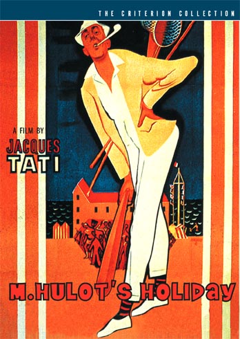
The list of Criterion releases is impressive and not at all a slacking one. The complete list (with links right to their corresponding Netflix pages) is here at the Criterion Cast podcast site (or by clicking the above & below images). It’s also worth noting that Criterion’s standards include routinely fantastic renderings of poster and cover art for their releases as well. Some of my favorites are below.

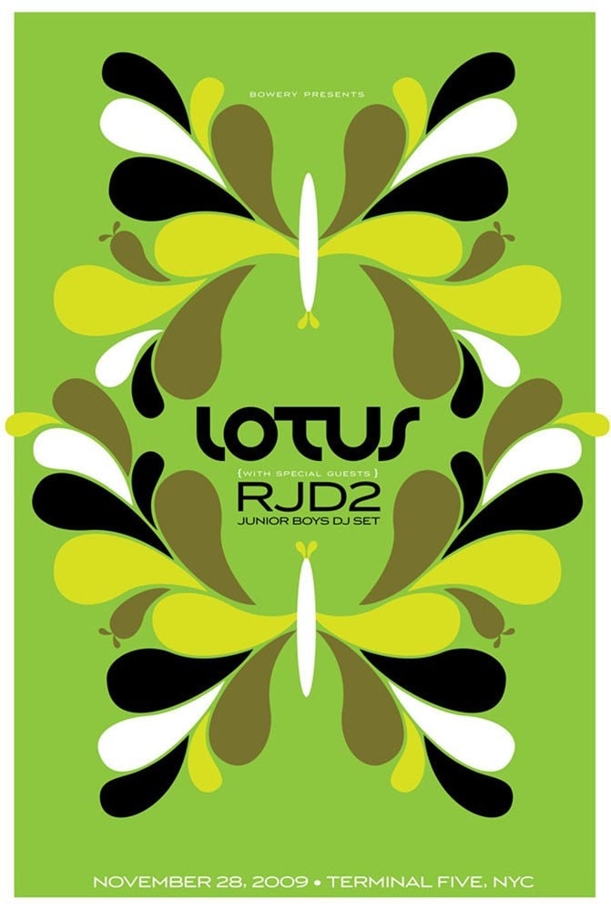
New poster released: Lotus w/ RJD2 & Junior Boys

4-color, hand screenprinted gig poster for Lotus, RJd2 & Junior Boys. (Click for more info or to purchase.)

Float on in.

This is my all hand screenprinted, limted edition poster for Lotus‘ show with RJD2 & Junior Boys DJ Set on Saturday, November 28th, 2009 at Terminal 5 in NYC, NY.

Mega chillout Lotus psych-style. Reverberation, symmetry and green dreams.

This is my 4-color hand screenprinted poster with light-green, yellow, and black hand-mixed, non-toxic water based acrylic inks.I have a very imited number of this poster for sale, as most of the edition was sold by the band on the night of the show. Size: 16w x 22h inches. Edition of 125. Paper: acid-free & archival Cougar 100 lb White, cover weight.

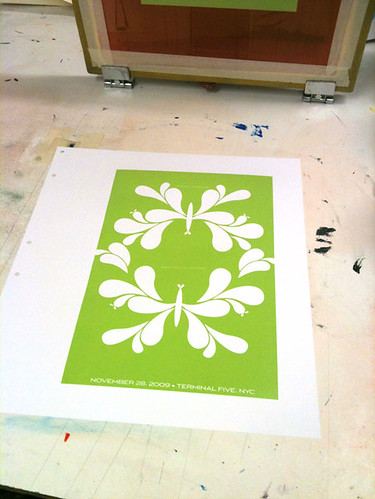
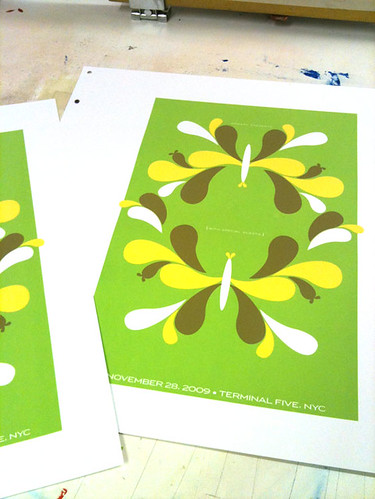
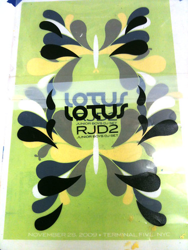
Click the above image to visit my website and for more information or to purchase. And hey! Below are some process photographs of this poster being hand screenprinted at my Flickr site:

1st color printed here.

3rd color printed!

Registering the 4th & final color.

Design For Obama, featuring my Vote! print

Design For Obama book, edited by Spike Lee & Aaron Perry-Zucker w/ an essay by Steven Heller. Click to purchase or for more information.

Hey! Remember the 2008 Presidential Election? The intensity, the rabble-rousing, the way that people were so directly affected to work for their chosen candidates? Well, color me included in that wave. Twice, if you will.

A poster that I designed and printed (my Vote! poster, below, or page 64 in your books!) to help get the word out about Barack Obama in the fall of 2008 was included in a fantastic new book called Design For Obama, published this November by the swell Taschen Books, edited & curated by Spike Lee & Aaron Perry-Zucker with an essay by design steward, Steven Heller.

2-color hand screenprinted poster, Vote! Click for more information or to purchase.

The book is culled from a collection of posters from around the world  that were submitted to and featured on the Design For Obama website before the election of the United States 44th President. Designers interested in the election and wanting to express their take on the entire Obama campaign’s story sent in an amazing series of work. When I became aware of the site, I sent in my own poster, which had already been printed, and in turn I was blown away by the work of hundreds of others who had also been feeling similarly. But don’t take my word for it, here are some of the editors words about their book:

Design/ers for Obama was created when Design Observer essentially asked the question, “how can graphic designers best support Barack Obama?” Our answer ended up extending the question to cover visual communicators at all levels. In addition to supporting Obama for America we jumped at the opportunity to bring the spirit of grassroots style organizing and collaboration to poster design which, to us, meant not only forming communal bonds but sharing the fruits of our efforts equally and in such a way that anyone can enjoy and benefit from (because most of us do not own our own printing presses).

Design for Obama was created by Aaron Perry-Zucker, a senior studying graphic design at the Rhode Island School of Design, and was built by Adam Meyer, a senior studying industrial design at said school. This website was inspired and is supported by Design Observer.

Design for Obama book key info for you:

If you are at all interested in design, art, the intersection of politics, propaganda and the previous, well…I don’t know what you are waiting for, this book is rad. I’m sure that it would make a great gift for the design and political wonks in your life too. Thanks very much to Spike Lee, Aaron Perry-Zucker & Steven Heller for including my poster in your kickass book. Cheers!

New poster released: The Spinto Band tour poster!

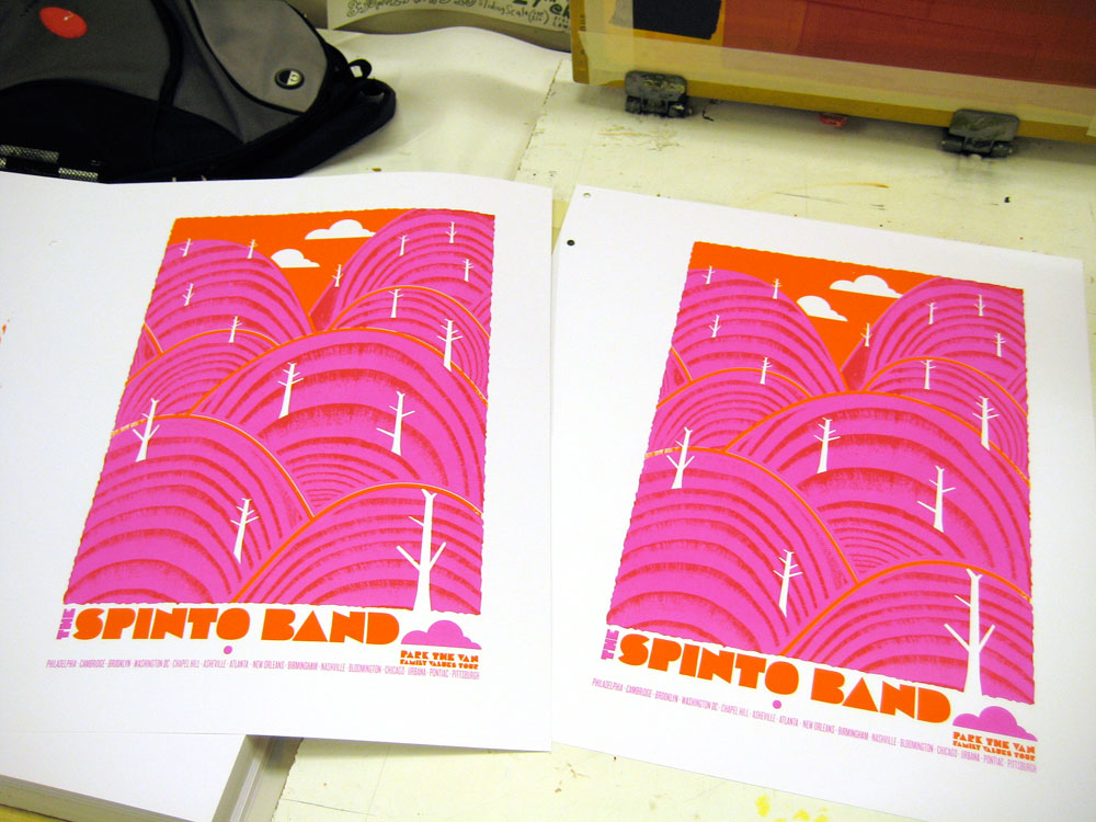
Hand screenprinted, 4-color tour poster for The Spinto Band,. Click here for more information!

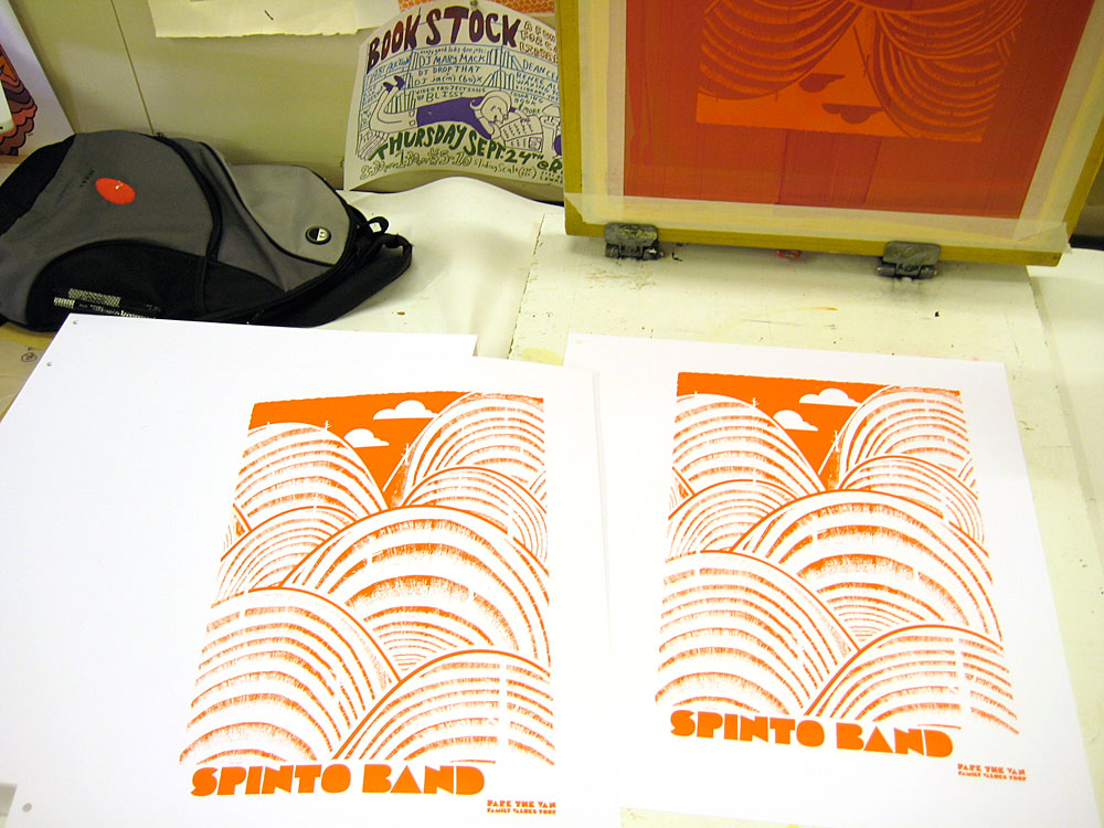
Hey hey! Brand new poster finally released and out there for you! It’s my fall 2009 tour poster for The Spinto Band, with Generationals & Pepi Ginsberg‘s Park The Van “Family Values” fall super tour.

Hooooraay! I love ’em. Bright, fun, hard workin’ and rad. 3 super sounds in one show poster.

This poster is my all hand screenprinted tour poster for some super bands (check them out and see if I’m lying.)

What you see here is a 4-color poster with magenta, sunny orange and black inks. Size: 16w x 22h inches. Edition of 145, though I have only 30 for sale and the rest were sold on tour with the band. Paper: acid-free & archival Cougar 100 lb White, cover weight.

Now available for purchase at my website HERE!

Here’s a couple photos of the print being built:

1st color down

2nd color, transparent magenta, lets the orange under layer show through and it makes a nice ruby red where they overlap.

And, some more good old fashioned hand printing process photos are here on my Flickr page too.

Sisters Red, by Jackson Pearce & my book cover design

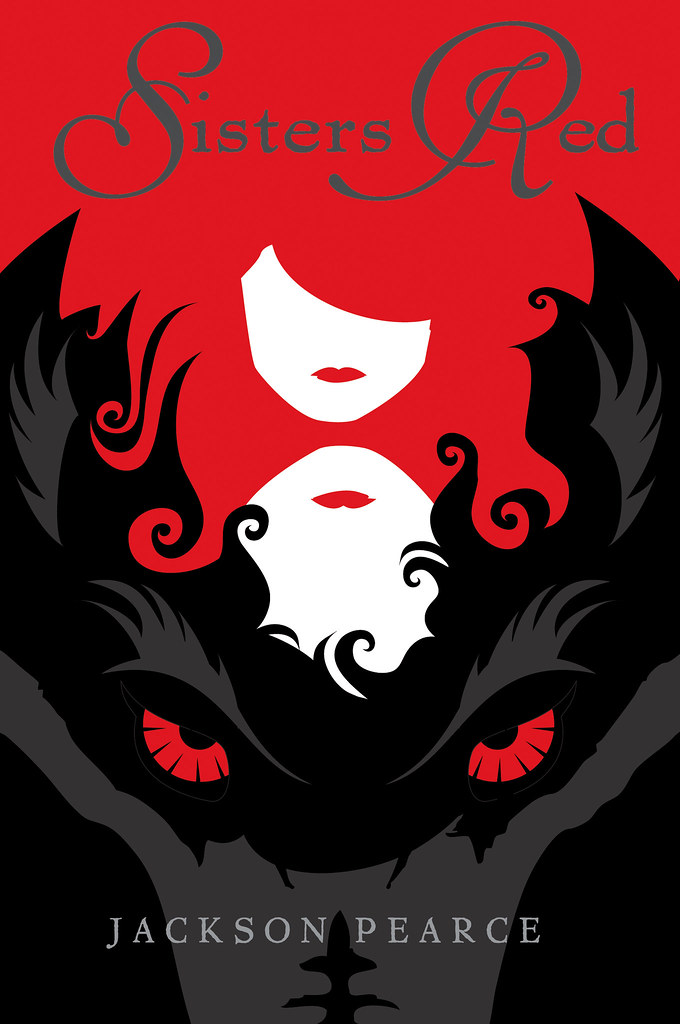
My ARC jacket design for Jackson Pearce's awesome new book "Sisters Red"

Well, OK, this post was a LONG time coming. I’ve been working on a bunch of really fun designs since the summer and haven’t posted many of them here on my blog. In part because for a few, like this one that I am SUPER excited about, I had to wait until everything was final and a full on GO.

And here we go! I got the chance and had the supreme pleasure of working with Little, Brown, & Co. on the book jacket design for Jackson Pearce, and really lovely and talented writer, on her newest book Sisters Red, which will be published to the public in June 2010.  Jackson Pearce describes the plot best, so I won’t bother to butcher it for you:

Scarlett March lives to hunt the Fenris– the werewolves that took her eye when she was defending her sister Rosie from a brutal attack. Armed with a razor-sharp hatchet and blood-red cloak, Scarlett is an expert at luring and slaying the wolves. She’s determined to protect other young girls from a grisly death, and her raging heart will not rest until every single wolf is dead.

Rosie March once felt her bond with her sister was unbreakable. Owing Scarlett her life, Rosie hunts fiercely alongside her. Now Rosie dreams of a life beyond the wolves and finds herself drawn to Silas, a young woodsman who is deadly with an ax– but loving him means betraying her sister and has the potential to destroy all they’ve worked for.

A little publishing world insider information: What you see above is the final design for the ARC Cover, aka the Advanced Reading Copy, this is a near-final copy of a book that is sent out for reviews, but that may still have final revisions before the actual publication date. ARC covers are typically not the complete or final design, though sometimes they are very close. (As we think in this case…don’t you?)

Naturally having read a manuscript copy of Jackson’s book Sisters Red I can tell you that it’s super awesome and that you should certainly find a copy next year when it’s out (I’ll post a reminder, don’t worry) because it’s quite good. But, in the meantime Jackson is hosting a giveaway of a few of her personal copies of her ARCs on her website here with a super fun video of “Things You Can’t Have” (including her adorable puppy and some of my prints eeeee!) and then happily “Things You CAN Have” too, so check it out.

The main problem that this designed needed to solve was to be eye-catching and to be something that would attract you from across a room, say at a bookstore. Fun challenge for sure. So, I hope that you like it.

Double thanks to Tracy & Little, Brown & Co. and Jackson!

Book publishers, see anything you like 🙂 Feel free to contact us for book jacket design, we love doing them!