Strawberryluna

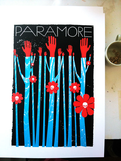
New poster release! Paramore, 2011 Tour “Hands Up” poster

Click to purchase or for more info.


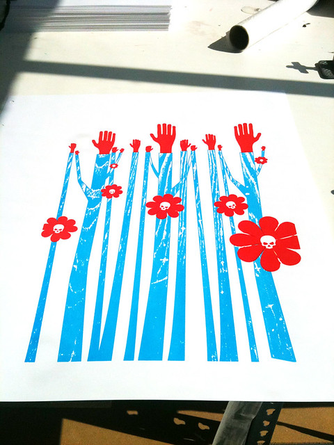
We’re mega excited about this one around here! Introducing our all hand silkscreen printed, limited edition poster for Paramore for their 2011 Tour.

The darker side of Spring exposed for the band Paramore here in our poster for them. We’re so stoked working with these guys on a Spring 2011 poster.
All things grow in Spring, but all things may not always be what you expect. Dark, sweet, and sharp. That’s the allure of Paramore.

Available for sale at my website here and also in my Etsy shop here, this my all hand screenprinted poster for Paramore with bright blue, midnight black and scarlet red hand-mixed acrylic silkscreen inks. Edition: 300 to the band (look for them on tour and from their website!) and an Artist’s Edition of only 50 posters is available for sale here. All 350 limited edition posters are signed & numbered (by me, strawberryluna) Size: 16×22 inches (39.4 cm x 55.9 cm.) Paper: archival Cougar, White 100lb cover weight.

Are you a Paramore Superfan? They you will love what they’ve done that’s all rad and high tech with their copies of our poster. Oh yeah! The future is here. Only at the Paramore webstore, each poster includes a QR code on the back that will take you to a website with three options for mobile wallpapers that feature three unreleased photos of the band. The QR code can only be scanned by those who have a camera phone with a barcode reader and internet connection on their phone.

And for you printmaking nerds (and I hope that you are, like me!) check out some process photos in my Flickr account too!
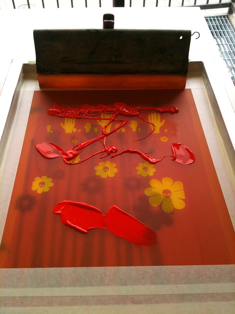
Mixing ink for our hand silkscreen printed Paramore poster. Click for more info.

Printing red skull flowers for our Paramore poster. Click for more photos of the hand silkscreen printing process.

Paramore hand silkscreen printed Tour poster, 2nd color. Click for more info & more process photos.

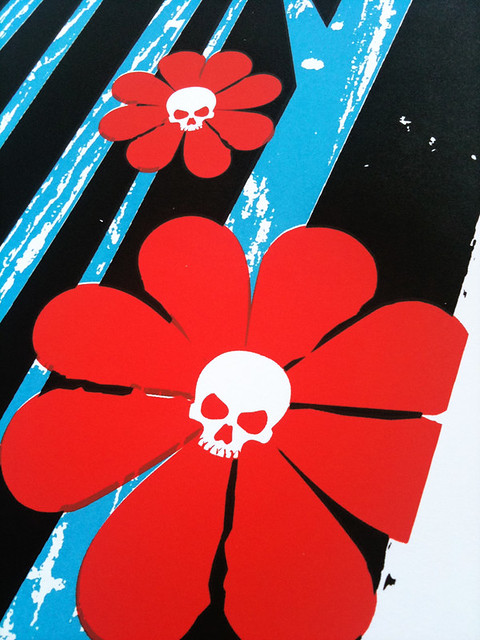
Detail show of our hand silkscreen printed Paramore Tour poster. Click for more process photos and details.

All done! 350 prints later, this is our all hand silkcreen printed Paramore tour poster. Click for more info and process shots.

Book Cover Design in India 1964 to 1984, from 50 Watts

Click to see more from this collection.

In my morning-coffee-stumble-through-the-internet-while-waking-up ritual today I came across a fantastically cool / I can’t believe that I didn’t know about this before blog, called 50 Watts, run by Philadelphian (yay! My hometown!) Will Schofield.

50 Watts is great little space of the web covering the intersection of book collection, design, and illustration. Sounds like heaven to me.  What caught my eye was an image from a post on now vintage book covers from the 40 year span from 1964 – 1984. Here, I’ve posted a few of my favorites, but definitely check out the full post at 50 Watts here.

And yeah, part of me wishes that I could read the text on these beauties. At the same time, they still speak quite clearly and the other part of me loves being able to make up stories about what these stories are about.

Click to see more from this collection.

Mostly, I just adore the flatness of the color fields, the kapow! of their graphics and layout, and symbolic style of the illustrations. Being a silkscreen printmaker, there is something so excellently familiar about the way that these were printed, probably cheaply, probably in a spot, or one color at a time process like screenprinting. You can see the areas where pieces aren’t in perfect register, or where colors overprint one another, and the use of halftones to mimic saturation levels of a color. All make my heart do little flips. The limitations of this type of printing force incredibly creative and freeing design and illustration choices, which, clearly I love and have embraced as a career. So, no. It’s no surprise that I dig these. I hope that you do too.

Click to see more from this collection.

Click to see more from this collection.