So you bought a piece of artwork that you love, yay! OK now what?
Yep. As printmakers and art sellers we get these questions on a weekly basis from our online shops and in person at craft & art fairs. If you are wholly unfamiliar with the elements of framing prints and artwork it can seem like a math puzzle with multiple sets of numbers to keep straight. But really? It’s simple, we promise.
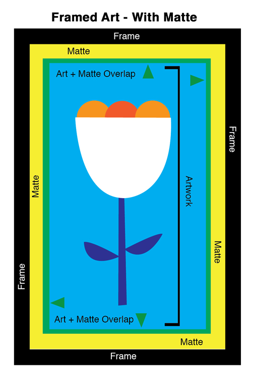
And to prove it, I’ve broken down the main elements in this blog post, photos, and diagrams that I illustrated for you. Ta-da!
The 3 Basic Framing Elements:
1. Artwork: The print, water color painting, vintage wallpaper, etc. that you want to display. This will be the smallest element in size. Shown here as my illustration of a tulip, including the entire artwork area.
2. Matte: A thick paperboard “frame” with an opening where your artwork will be centered. A matte helps to keep your new print centered and flat in the frame as a print will often be attached to the Mattes can be any color (white or black are the most common), any width, and you can even “double matte” (or triple matte if you are feeling ultra fancy) artwork by layering 2 different sized mattes over one another and over your artwork to be framed. Your matte will be longer and wider than your artwork / image size at it’s outer dimensions, but the inside opening will cover the edges of your artwork / image area (the green areas as above) for a seamless fit. The matte doesn’t have to cover your artwork uniformly, it just needs to lay over the edges so that your artwork is centered in the matte’s opening.
3. Frame: The frame that you choose, yep, it’s pretty self-explanatory. But like mattes, frames come in many sizes, but also in a wide variety of materials such as metal and wood, and in practically any color and finish that you can imagine. The frame will be your largest sized element, and like the matte goes over the edges of your artwork? Your frame will go over the outer edges of your matte (which in turn are over the outer edges of your artwork). Framing is basically a layering game!
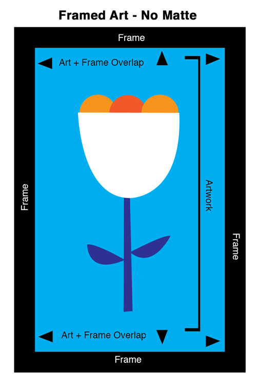
However, note that a matte can be an optional element of your framed art, depending on your style and the artwork itself. Above you see a my diagram of the same artwork in a frame, but without a matte. To illustrate that difference further below are two examples of our Ghost Ship By Day Print framed, one with and one without a matte.
Example A, Framed with a matte:
Here is our 3 Fish screenprint, sized 16×22 inches and framed with a 1 inch matte, in an 18×24 inch simple black frame. As the first diagram above “Framed Art With A Matte” shows, the matte actually extends the content of the frame out to fill the interior. So in this case a 16×22 inch print fits beautifully into an 18×24 inch frame with a matte, because the matte covers the edges of the print and is cut to fit the frame size neatly.

3 Fish Print, size 16×22 framed with a matte in an 18×24 inch frame.
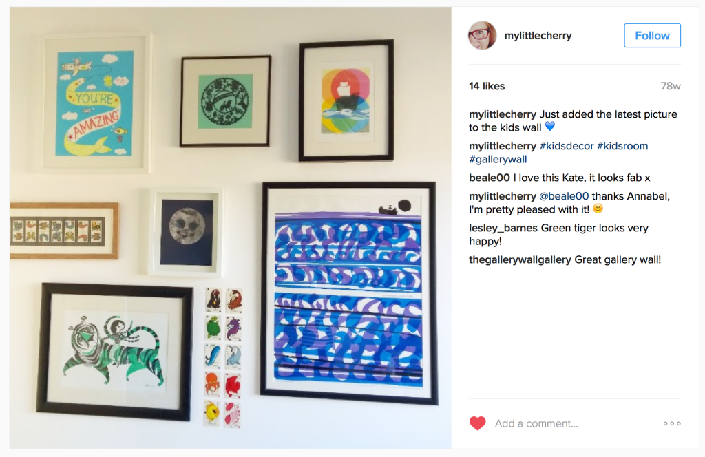
In another example with a matte below, in the upper right corner (photo by a sweet customer with great taste in prints @mylittlecherry on Instagram) shared this gallery wall photo with our Ghost Ship By Day Print on the top right:
 Example B: Framed without a matte:
Here is our Be Kind Always Print, sized 12×12 inches and framed in super cute birch wood frame without a matte. As the second illustrated diagram above “Framed Art Without A Matte” shows, the print itself extends all the way to the inner edges of the frame. So there is no need for a matte at all.

Our Be Kind Always Print, framed without a matte in a 12×12 inch frame.
And the same Ghost Ship By Day Print from earlier in this post is also shown below without a matte, in the middle between two cuties (photo by one of our lovely retailers @apple.village on Instagram):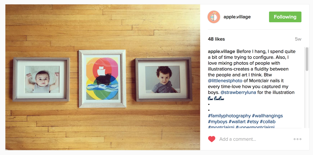 Example C: Unframed, with magnetic wooden print hangers:
And finally we love this option for a clean, casual and modern approach. No frame at all, instead the art work is held between 4 wood slats with magnets embedded into them so that the hangers clamp together and hold your print in place, as below, once again using our 3 Fish screenprint as an example:

Our 3 Fish silkscreen print hung with magnetic wooden slat hangers.
OK! I’m ready to frame my art! Now what?
As for the actual frames? Again, lots of choices to fit every aesthetic and budget are available. We love our local Frame Shops here in Pittsburgh:
We adore five places online that have great frames and mattes that offer all American Made materials, plus all frames and mattes are cut to your specs, which is amazing and really great. They all ship quickly and safely. All very affordably!
⇒ Frame USA – Our favorite online go-to! No really. For DIY framing or bulk frames, and super specific specs and variety Frame USA is the tops. You can find standard US frame sizes or enter your custom dimensions and they make your frames and mattes to order. Great for odd sized artwork and / or out of standard matte needs. All of their materials and frames are made here in the USA, featuring an incredible selection of reclaimed and first-use wood, metal, and composite frames in a huge array of color options, including mattes and accessories from super affordable to super high end. They make framing projects so easy.
⇒ Craig Frames – Much like Frame USA above they have a wide selection of frames and mattes. They are somewhat less customizable in terms of sizes, with an emphasis on standard US frame sizes. But the size selection essentially runs the gamut of most needs. You can buy frames and mattes separately, or, go with their pre-made kits in standard sizes. Including bulk packs of frames too, which is really nice and easy for stress free framing. Craig Frames is a solid “plug & play” option.
⇒ All Barn Wood – many of their frames have a more rustic and camp vibe with lots of reclaimed wood options.
⇒ Matteboard And More – offers custom size, color, and material options in mattes, backing boards, frames and show kits and more.
⇒ We Are Well Made – Our go-to place for the super fresh magnetic wooden STiiCK print hangers. STiiCKs, simplify the framing process by eliminating the glass / plexi front and matte. Strong magnets, embedded just below the surface of each wooden slat, clamp art at the top and bottom without damage, and makes for a very modern look with a casual low-fi vibe.
There are of course great off the shelf options these days now too at places like IKEA, Target, Bed Bath & Beyond also where frames usually come with a matte included. If you are going that route, we suggest that you find a frame that you like, and then get a matte custom cut to your artwork’s size for about $10 at places like Michael’s & JoAnn’s craft stores, or at your local favorite framery (see ours above) or art supply shop.
So there you go! If you have any questions feel free to comment below. We hope that this post helps you get you new artwork up & beautifully displayed.
Save
Save
Save
Save
Save
Save
Save
Save